Correlating EGI: Is It Luck?
It’s important to understand where EGI comes from if we want to predict it for the future. With about 20% of the season past, it’s possible to draw some early conclusions about the underlying factors of EGI. Looking at an individual game, it’s easy to see if that game is going to be scored well: lead changes, late come backs, blown saves – all of these things will drive the score up. But what gets a team into these situations?
Certainly being in close games makes a big difference. Blowing out too many games, or being blown out won’t keep people interested late in the game. Take a look at the Angels, the least exciting team, and you’ll see a lot of blow out games (in both directions). In fact, only 15 of their 34 games have been within 3 runs. Compare this to the Nationals, who have 25 of 33 games within 3 runs, and 16 of 33 within 1 run.
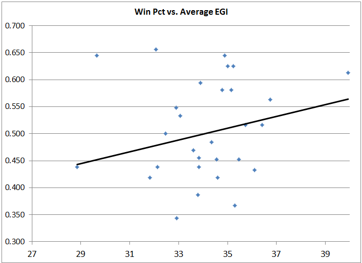
Trying to correlate EGI to a few common statistics turns up no clear correlation.
With a very low R-squared value, it appears obvious that actual Winning Percentage is not driving EGI. Similar low R-squared values exist for many other common team statistics.
| Metric vs. EGI | R-squared Value |
| Runs Allowed |
0.0016 |
| Runs Scored |
0.0111 |
| Starter ERA |
0.0265 |
| Bullpen ERA |
0.0031 |
I was most surprised at Bullpen ERA, as I figured giving up runs late would cause a spike in EGI, but it has one of the worst fits. Trying to transform some of these stats proved equally fruitless. ERA Ratio is the ratio of Bullpen ERA divided by Starter ERA. A number over 1 means the bullpen is worse than the starters. ERA Diff is the difference between the Starter ERA and the Reliever ERA. Run Differential is Runs Scored minus Runs Allowed.
| Transformation vs. EGI | R-squared Value |
| Run Differential |
0.0035 |
| ERA Diff |
0.0230 |
| ERA Ratio |
0.0297 |
| Pythagorean Win Pct |
0.0005 |
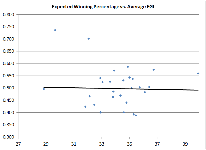
Most notable from the different charts is actually the Expected Winning Percentage based on the Pythagorean formula for Runs Scored and Runs Allowed. If you’re not familiar with the formula, check out this primer. Comparing Average EGI to the Pythagorean Expected Winning Percentage shows a terrible fit and no correlation. Compared to the above Winning Percentage chart, this is somewhat unexpected.
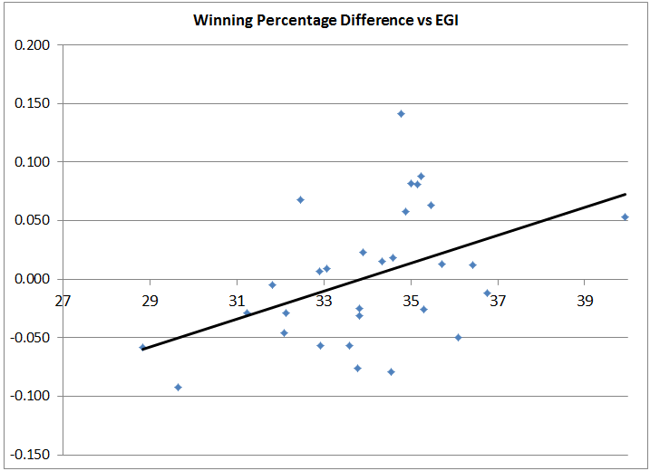
What of the difference? Subtracting the actual winning percentage from the expected winning percentage, we can see teams that are playing above and below their potential. Charting the difference between the two actually shows a relatively decent trend with our best fit.
While this fit is not exceptional, it does seem to indicate that the better teams are playing relative to their expected winning percentage, the more exciting baseball they are playing. This appears to make some sense. Teams that are playing better than expected are probably winning a lot of close (exciting) games. However, teams that are playing below their level should also be playing exciting baseball, as they are losing a lot of close games. It appears that lucky teams – teams that win a higher percentage of games than we’d expect – are the ones playing the exciting games. Lucky them.
It’ll be worth looking at this over a larger sample size in the future.


